Wednesday, September 28, 2011

A Night at the Circus - Negative Space


This is the first painting I've done with all those photos I took at the photos I took Sunday. I really wanted to play with the negative space created by the contrast in the photos, and with blending washes of colour for the background. It's taking the little grey watercolour I did a few weeks ago to an extreme. 

This was a bit of an experiment to see how much detail I need to convey the information I want, and to trial a style I really like. I think it would be excellent in backgrounds and atmospheric scenes, especially if I ever get to do a graphic novel, like I keep talking about. Something very Film Noir. I sort of imagine this as the first step, with detail added to the foreground and any important figures.

I put the finished painting at the top because I'm curious to get some feedback before you see the photo it's from. Can you tell what the picture is of? I can easily tell, but a friend of mine was completely confused. Of course, he doesn't have an artistic bone in his body, but as his eyesight is as good as anyone else's, I'd like a second opinion. 

Here's how it all came together. The photo, cropped to size:


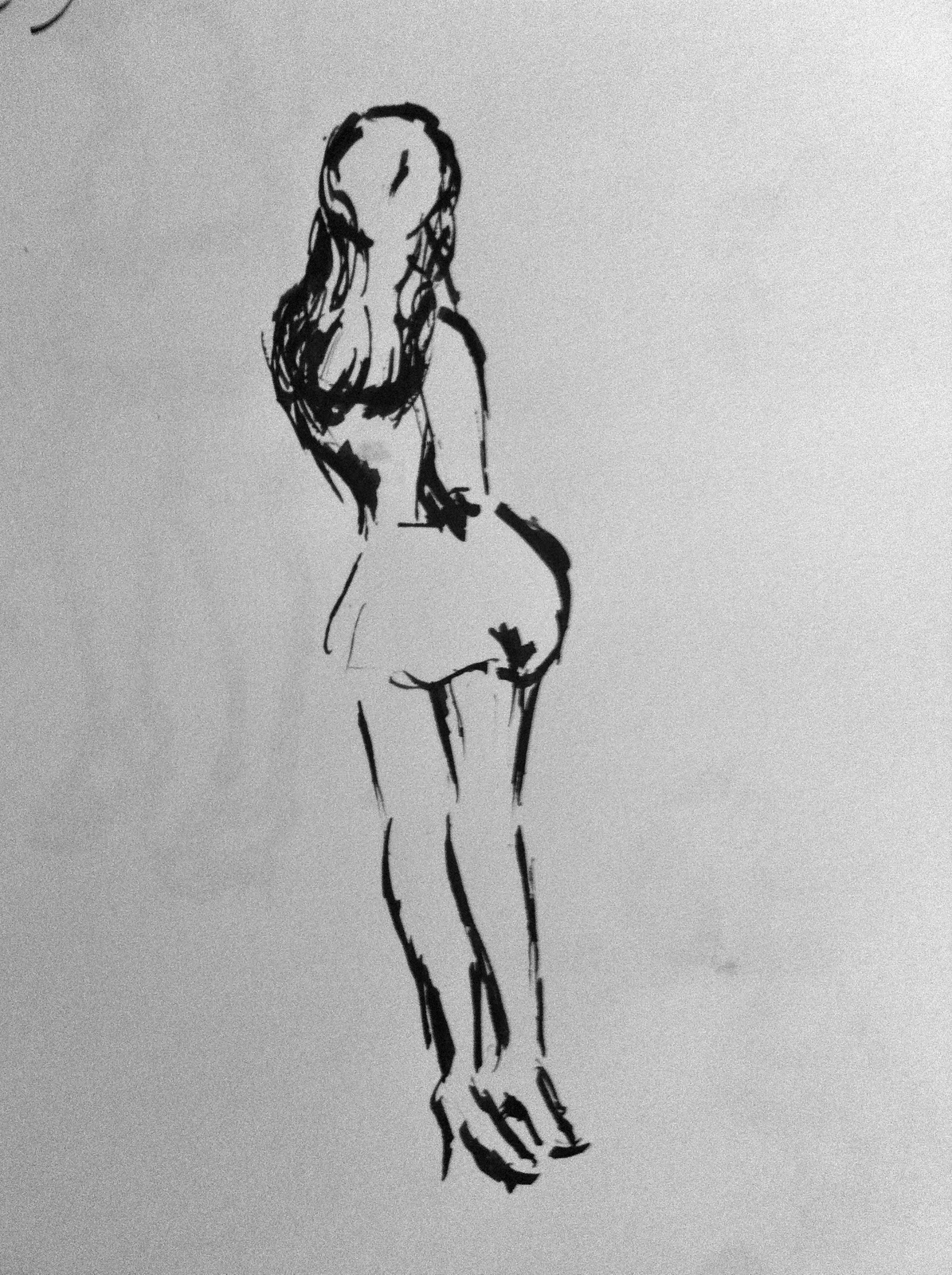
I used to 'threshold' edit in Photoshop to try and determine exactly how much detail I could put in/get rid of and still have a recognizable figure (you can tell me if I picked the right balance):


Here's the sketch, taking out the extra detail and person. I just wanted a simple image:


Followed by masking fluid based on the Photoshop image. My idea was that I could then play with the colours however I wanted, and the girl would still be recognizable. Any detail I added would be a bonus:


And here it is before I took the masking fluid off. I love that bit:


Tuesday, September 27, 2011

A Night at the Circus - Reference Photos

I took quite a few reference photos while I was at the Drawn & Plastered night. None of them are any good as photos, but I was just using my phone to get some poses, and the Hipstamatic app because I like what it does with the colour and light. I find bad and flawed photos tend to make the most interesting paintings. I have a few things in mind for these, can't wait to see if it turns out the way it looks in my head!


Monday, September 26, 2011

A Night at the Circus - Sketches

Last night I went to Drawn & Plastered, an event held about once a month here in Winnipeg. It was a fun night, I got to go to a pub, have a pint and do some sketching. Right in my element! The theme for the evening was 'Circus', so the models were in costume, and they even had a couple little shows too. I took plenty of reference photos, which I'll make something of shortly. I certainly didn't create any masterpieces, but I enjoyed myself anyway. 


Thursday, September 22, 2011

Tep's Wedding Portrait - Ready for Framing


I'm very pleased with this and can't wait to get a frame. They're coming to visit for Thanksgiving, so I've got two weeks to get everything ready, which should be plenty! I wish it photographed a bit better, because it's reflecting a little on the whites, and washing out the colours in the darker areas. Nevertheless, I'm sure you get the idea. Can't wait to give it to her!

Sunday, September 18, 2011

Tep's Wedding Portrait - A Bit of Life

Looking at the last photo I took of this pastel I realized that the entire thing was fairly dull. There wasn't much vibrancy or life to the two, supposedly happy, people. So I went over it and added some depth, darker skin tones, more colour in the background, and a bit of contrasting colour to make things pop. The photo isn't capturing all the changes, but the overall tone of the piece has a lot more life in it. Not for more contrasts, and to go over the details.

Saturday, September 17, 2011

Tep's Wedding Portrait - Moving right along

This stage of the portrait seemed to go very very quickly. I think I need to adjust the features a fair bit, but I still like how it's coming over all. I also need to start thinking about how I'm going to do the dress, since it was lace, and the background simply isn't anywhere near developed enough to suit the portrait. Much to do!

Wednesday, September 14, 2011

A Career Change? or The Art of Everyday Life

Once upon a time I wondered what I should do with my art degree, and one of the things I looked into (or googled, at any rate), was interior design. It would have required a whole lot more school, so I left that idea behind, but I really do love putting my home together. Here are a few shots of my new, obviously owned by an artist, condo.

Although the bedroom is separate from the rest of the place, it's nevertheless still technically a
 bachelor, and therefore severely lacking in storage. It doesn't have a closet, so I made this shelving unit to show off the clothes I wish I got to wear more often. After all, they're lovely, and this way I make them into an art display.


This table was custom made in Indonesia from an old temple door. It seats six easily, and eight fairly comfortably.  As I love having people over, and figure on usually owning a small space I wanted multi-purpose extensions for it. The end tables in the previous, bedroom, photo are those extensions. They're the same height and width as the table, and can fit a person on either end (albeit a fairly slim one), meaning I can feed twelve people should I take it into my head to do so, but at all other times have two separate and functional pieces of furniture.

 I have a token brick wall, because I am apparently a yuppie. I love my postcard/random art collection. They're just clothpinned to ribbon, so I can change up that display whenever I want. I love that painting but I'm starting to feel I should try to store it somewhere, despite it's size, because there's already quite a bit going on.

The lack of storage led to these shelves,  which are actually old door frames (the top bit), from a local place that specializes in stuff from, and to restore old homes. I was planning on using them as a base for a shelf, but they're actually wide enough to display things as is.

That red man is actually a knife block. I traded a drawing for it. That little ledge/laptop/stool area is my studio.

Monday, September 12, 2011

The Sketchbook Project - Some Days

I'm not usually one for abstractions, but, well, some days are like that...


Sunday, September 11, 2011

Found Art

This isn't exactly something I made, but it is something I painted, so here's a quick photo of m new bathroom mirror. I've had this old mirror lying around for about six years now, and for some reason it made it in the move to Winnipeg. I had a hideous big, frameless mirror in my little bathroom, which was totally inappropriate for the size and shape of the room, so I tore it off. I also changed the cheap ugly light fixture. I painted the frame of the old mirror, which used to be a terrible fake gold colour, and hung it instead. A little creativity for my new condo:


Saturday, September 10, 2011

Love What You Do

While I'm waiting for training I work at the Multi-media lab on base, doing graphics and such for the training courses and videos we produce. Occasionally I'm also an actress or voice for our productions, as we often need people and we're the easiest ones to call on. The lab has five full-time staff, and three part-time students there on a government program to get work experience. It's easily the best job I've ever had, and I think I can probably claim to have more fun at work than the average person on a day off.

We're currently working on a video about logical arguments, and this little clip is going to be a small section of the larger 'before' section:


We're not actually going to leave that blood-splatter on there, one of the students sped the car up more and added that just for fun. Typical day at work.

I'm also working on a big project that's entirely in the form of a motion comic. It's turning out fantastically well (I'm saying that about all the backgrounds I'm doing for it anyway), and if I can I'll share it, or at least a portion, after the animation is done.

Wednesday, September 7, 2011

Tep's Wedding Portrait - First Colour


Now that I have the basic shapes in I've gone over the portrait with a first, pretty rough try at the colours. It's a little strange because they have the identical skin and hair colour (Mennos! They all look the same) but I want to differentiate between them, at least a little. I've lightened his hair a little, which is helped by the balding, so I can work more of the skin tone in. I really need to start a little blending, And definitely darker it up, so I can go in and put the highlights in later. I think I should have started with the base skin colours, more reds and oranges and blues, then put in the lighter tones on top. Oh well, it's early in the portrait, I have lots of room to make corrections. 

Tuesday, September 6, 2011

Tep's Wedding Portrait - Form

I got right to work on my sister's present (and by right to work, I mean I spent a couple hours picking what tea I should have, rearranging my pastels, and creeping Facebook). The first stage was to put in highlights and shadows, trying to pay more attention to what needed to come toward the viewer (yellow) and what needed to recede (blue). I'm not always god at distinguishing between that, and what's simply lighter or darker. Oh well, it's still a good start:


After that I put in the lights and darks. I used an off-white and purple, because I don't want to desaturate the image too much, which is easy to do when they both have very pale skin and aren't wearing any colour:


Saturday, September 3, 2011

Tep's Wedding Portrait


My little sister got married this summer, and I still haven't given her her present! I usually give my friends a painting or drawing they like, and bring it to the wedding. I was a little behind on this one, so I'm doing one of my favourite photos from the wedding in pastels, and I'll either ship it out or hold it hostage until she comes to visit. The reference photo is above, and this is what I've got so far:


I really like this blue-grey paper, and I think it will lend a nice soft colour to the finished product. I'm going to do it in colour using some of the many many other photos taken that day for reference. I intend to make this a little softer and more 'pastely' than the previous pastels I've done. I want to take better advantage of the medium, instead of the very tight style I've used while familiarizing myself with the pastels. It will be a challenge to maintain recognizable portraits while using something closer to my usual loose, painterly style. Stay tuned, we'll see how this all works out!

Friday, September 2, 2011

Life Drawing Session - Shades of Grey

I wanted to play around with lights and shadows, so I grabbed a photo (so, no, not actually a life session, but I'm keeping the blog titles similar for orginization sake) and tried drawing it with just black, instead of shading everything in. I always love the way sections can be entirely missing, like the edges of the leg and arms, and yet the brain fills in what's missing. I was paying more attention to the shadows than the drawing, so the details are a little off, but  I like the way it turned out anyway.

I took this sketch and made a small watercolour from it, done in washes of grey-ish navy and brown watercolour, and black ink.